What Is the Best Font for a Self-Published Book?
Overview: Finding the best font for self-publishing
Fonts for self-published books are a bit like ice cream. So many great options! Which one to pick?
Deciding on a font for your book can be an important decision. You’ve either not thought about it sufficiently (potential hazard ahead!) or you’re wracked by indecision. (Stop wasting time and finish the dang book!)
A great font enhances the reader’s experience and reinforces the overall look and theme of your book.
I’ll give you, the self-published author, some tips about fonts for the interior layout of your book.
Here are some questions I get asked from time to time (and answers).
What is the best font for my self-published book?
For most adult nonfiction and fiction books, try one of the fonts below.
Libre Caslon is a versatile font that is appropriate for fiction and nonfiction books.
Also consider Libre Baskerville, Cormorant, Garamond, Georgia, Jenson, Lora, Minion Pro, Palatino Linotype, Sabon, or Utopia.

An excerpt of text in the Cormorant font.
Some tips to remember:
The font must match your genre and subject.
Try a more modern-looking (and newer) font for a science fiction & fantasy book. Try something more formal, more classic, for a research-driven book. Try an older font for a novel set in the eighteenth century. Use a more whimsical or attention-grabbing font for a children’s book. Try a more masculine font or a more feminine font if it would fit your audience.
Should books use a serif font or a sans serif font?
Some folks say that fiction books use serif fonts and nonfiction books should stick to sans serif fonts. I don’t subscribe to that advice.
Serif fonts have a more traditional look. I find them more readable. These fonts have spikes or slabs on the ends of the letters.
Sans serif fonts do not have those spikes or slabs. They have a more modern look to them. If that’s what you want, then try something like Roboto or Source Sans Pro—especially for nonfiction books on business, technology, and investing.
American nonfiction authors: Self-publish with ease, confidence, and effectiveness—
Self-publish to Amazon and elsewhere—with your ducks in a row and with author resources for self-publishing that you need to know about.
How should I choose a font for my book?
Choose fonts for your book using Google Fonts or Font Squirrel.
One way to find fonts is to use Google Fonts.
You can browse or search. You can copy and paste a passage of text for a preview of what that text will look like in a given font. You can also generate a sample sentence or paragraph, among other options.
Another good way to find fonts to use Font Squirrel.
Similar concept. Great preview features.
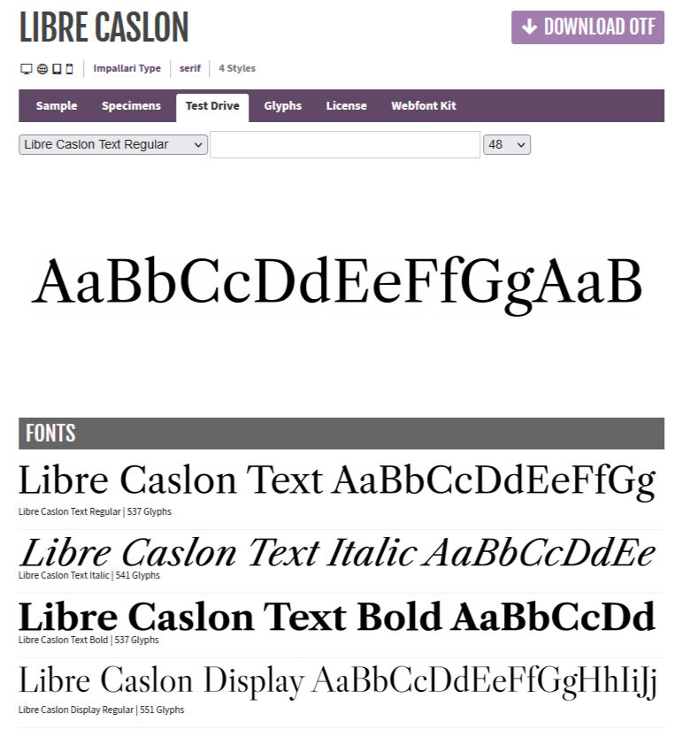
Here’s what it looks like for Libre Caslon.
Or experiment with the fonts provided by Word or your word processing program or design program.
Using a PC, in Settings, Font Settings you can browse and search available fonts and see what regular, bold, and italic versions look like.
To view and print fonts on your Mac in Font Book, click here.
What if the font I like is not available on my Mac or PC?
For both Google Fonts and Font Squirrel, you can download fonts and install them to your computer.
You can download, then drag and drop downloaded fonts in the Settings, Font Settings feature of Windows.
On installing fonts on a Mac, click here.
What’s the best font size for self-publishing?
Usually, an 11-point font is the best font size for self-published books. Depending on the font, you can experiment with a 10-, 11-, 11.5, or 12-point font. This may depend slightly on your anticipated reader. A book marketed to seniors, for example, might need a larger font.
More tips on book text fonts:
Avoid common fonts.
That means avoid fonts like Arial or Times New Roman. It won’t enhance the reading experience. It won’t make your book stand out. Readers have seen these fonts many times before, and their eyes may glaze over.
Avoid drop caps in an ebook file.
Any TrueType Font (TTF) or OpenType Font (OTF), and one that is listed in Google Fonts or Font Squirrel are generally a safe bet.
These are likely to work in both print book and ebook formats and are unlikely to cause any issues as far as accessibility, permissions, or licensing goes. Professional designers may have access to additional fonts through InDesign and related software; those too are generally suitable for publishing too.
Try to determine how the font would look in the reader’s hand.
Try printing a page of your book layout with the exact margins of your print book or e-reader. If you see another book with a font you like, see if you can identify the font used. Sorry, there’s no reliable way to do that, but sometimes font information is listed in the front matter or back matter of a book. You could also ask the author.
You may want to switch up your font now—even if you’re not self-publishing (now).
You'll see your writing a little differently and may be able to catch mistakes or view your work with fresh eyes.
It may help the self-published author get a better result with their editor. And it may help the traditionally-published author pitching a book to a publisher or agent to switch up the font.
Amazon KDP, IngramSpark, Barnes & Noble, Lulu: What fonts are recommended by these platforms?
Yes. I’m glad you asked. 🙂
For Amazon KDP font recommendations, click here.
For IngramSpark’s suggested book fonts to use, click here.
To see what Barnes & Noble Press fonts are preferred, click here.
Lulu suggests these book fonts (including font suggestions for graphic novels and photo books). Click here.
For help self-publishing, check out my step-by-step digital course on the self-publishing process or my coaching services.